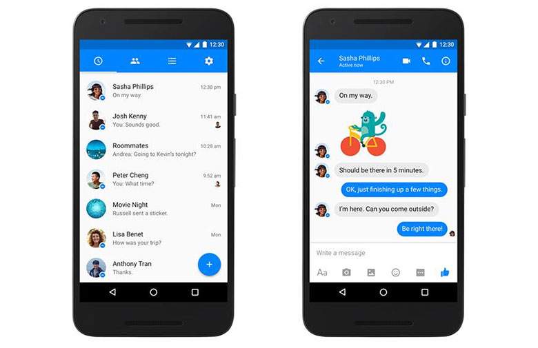
Social networking giant Facebook has given its messenger app a new look on Android. After a few months of testing the social network has rolled out the new Material Design-inspired version of its Messenger on Android platform.
The new update for the messenger was launched on Google Play on March 7, 2016. The new design has inspirations from the modern design principles that Google had laid out in 2014. And has since then applied to its own apps on iOS, Android as well as on the web.
Some of the main changes to the Messenger include a new solid blue navigation bar at the top with white icons for timeline, people, groups and settings. The strip has been replaced by grey icons and the same change has been made to the status bar which is now blue with white text and action icons. The older design had employed a blue bar but that was located at the bottom while offering an entry point to search and start a new chat.
That feature has been replaced by a blue circle with a plus symbol. On the other hand Facebook has not seemed to introduce any new features on its Android chat app. Some of the users might already be familiar with the new messenger as it has been on a testing spree for a few months.
Photo Credits: pocketnow


